-
Webpage Analysis

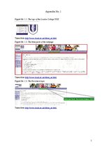
The design of the webpage is rather good. Basically the principle of economy or simplicity has been maintained (the use of no more than three elements). There are mainly used only three colours – achromatic colours black and white and an accent chromatic colour blue. These are also the colours of the logo (see appendix No. 1, figure No. 1.1.). This is used to facilitate a visitor’s perception. These colours also send the right message to a visitor in a subconscious level as the blue accent colour creates the associations of confidence, stability, intelligence, truth, trust, loyalty and wisdom1. The whole webpage is divided into three parts (also simplicity principle) (see appendix No. 1, figure No. 1.2.). Two of them function as menus for different options that can be explored. One of these two functions only as a menu while the other also includes a logo and several images (again three elements – menu, logo, images) and this one also does not change its content regardless of the chosen option. The third part is an explanation part where the information is stored depending on the chosen topic. The whole webpage design - layout and colours – does not change; it is constant for all of the options and textual parts. …
The present report is an analysis of the webpage of the London College UCK. The analysis includes the following issues: target audience, design of the webpage, aspects of Integrated Marketing Communication (advertising, sales support, customer service, and public relations), noises in the communication, mission and vision overview, and several suggestions for improvement. In order to analyse the mentioned issues, the following webpage was researched: http://www.lcuck.ac.uk. It was discovered that the webpage has a rather good design, but the aspects of Integrated Marketing Communication are not fulfilled effectively, there are several minor noises in the communication, and while there is a mission statement, there is no vision statement. It is also suggested that the London College UCK should improve its webpage.